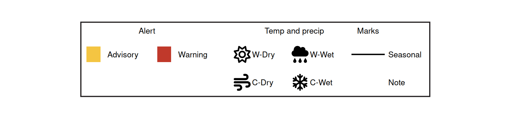
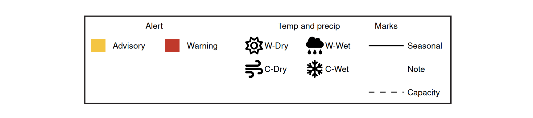
ggpop gives you two ways to build a legend, and picking the right one keeps your code short:
-
Native icon legends - for a legend keyed to your plot’s data. ggplot2 builds it for you; you only switch the keys to icons. This is what you want almost every time.
-
Standalone composite legends - for a legend that is really a small annotated figure, decoupled from any plot (multiple grouped columns, mixed symbology, fixed pixel dimensions). ggplot2’s guide system cannot express these, so
marker_legend() draws them for you.
The common case: native icon legends
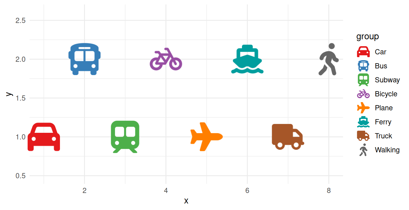
Map an aesthetic, set legend_icons = TRUE, and let ggplot2 do the rest. The icon keys are drawn by ggpop’s custom key glyph and recoloured to match each group; scale_legend_icon() sizes them.
Show the code
df_modes <- data.frame(
x = c(1, 2, 3, 4, 5, 6, 7, 8),
y = c(1, 2, 1, 2, 1, 2, 1, 2),
group = c("Car", "Bus", "Subway", "Bicycle", "Plane", "Ferry", "Truck", "Walking"),
icon = c("car", "bus", "train-subway", "bicycle", "plane", "ship", "truck", "person-walking"),
stringsAsFactors = FALSE
)
df_modes$group <- factor(df_modes$group, levels = df_modes$group)
col_map <- c(
Car = "#E41A1C", Bus = "#377EB8", Subway = "#4DAF4A", Bicycle = "#984EA3",
Plane = "#FF7F00", Ferry = "#009E9E", Truck = "#A65628", Walking = "#666666"
)
ggplot(df_modes, aes(x = x, y = y, icon = icon, colour = group)) +
geom_icon_point(size = 6, dpi = 120, legend_icons = TRUE) +
scale_colour_manual(values = col_map) +
coord_cartesian(ylim = c(0.5, 2.6), clip = "off") +
scale_legend_icon(size = 6) +
theme_minimal()
Tip
For any legend tied to your data, stop here. The native path stays in sync with your scales automatically and needs no manual layout. Reach for marker_legend() only when you need a standalone composite that ggplot2 guides cannot produce.
One ordering rule: scale_legend_icon() must come after any theme() call, because a later theme() resets the legend key size.
Markers beyond Font Awesome
The icon aesthetic accepts more than Font Awesome names. ggpop ships a set of bundled markers, and you can register a folder of your own .svg files. List what is available with ggpop_markers():
[1] "circle-cross" "circle-hollow" "circle-inset"
[4] "circle-solid" "diamond-cross" "diamond-hollow"
[7] "diamond-inset" "diamond-solid" "plus-bold"
[10] "plus-hollow" "square-cross" "square-hollow"
[13] "square-inset" "square-solid" "triangle-down"
[16] "triangle-down-inset"
These names work anywhere an icon is expected - in the geoms above and in the composite legends below. To use your own SVGs, pass a folder via icon_path (or set options(ggpop.icon_path = "path/to/svgs")) and reference each file by its bare name.
Standalone composite legends with marker_legend()
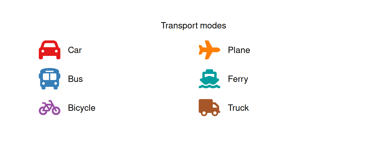
When a legend needs multiple grouped columns, mixed symbology, and a fixed size - the kind of figure often exported as a standalone image - ggplot2’s guide system falls short. marker_legend() takes a tidy data frame of icon + label (+ optional per-row colour and column) and lays it out for you.
A Font Awesome composite
No bundled markers required - any icon source works, including mixed sources in one legend.
Show the code
df_legend <- data.frame(
column = c(1, 1, 1, 2, 2, 2),
icon = c("car", "bus", "bicycle", "plane", "ship", "truck"),
label = c("Car", "Bus", "Bicycle", "Plane", "Ferry", "Truck"),
colour = c("#E41A1C", "#377EB8", "#984EA3", "#FF7F00", "#009E9E", "#A65628"),
stringsAsFactors = FALSE
)
marker_legend(
df_legend,
title = "Transport modes",
marker_size = 5, label_size = 4, col_spacing = 14, label_gap = 1.6
)
Multi-column composite legend
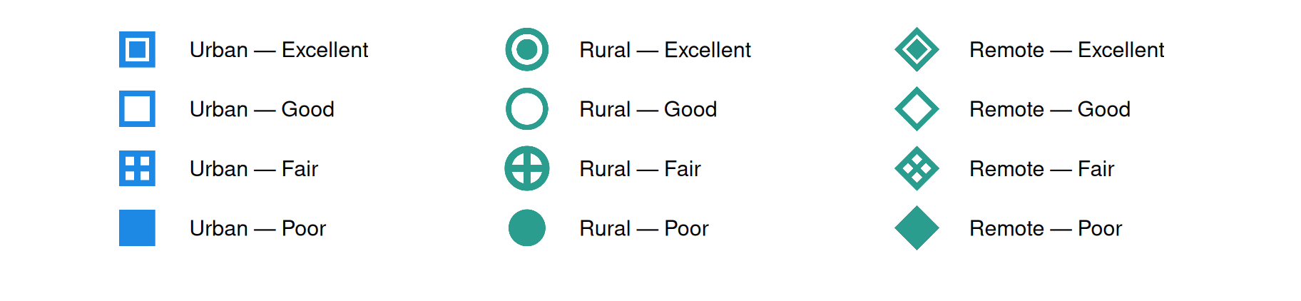
This is the use case marker_legend() exists for: a multi-column legend that encodes two semantic dimensions simultaneously — here, region type (colour) and indicator domain (column) — using bundled markers to distinguish subcategories.
Show the code
blue <- "#1E88E5"
teal <- "#2A9D8F"
df_legend <- rbind(
data.frame(
column = 1, colour = blue,
icon = c("square-inset", "square-hollow", "square-cross", "square-solid"),
label = c("Urban — Excellent", "Urban — Good",
"Urban — Fair", "Urban — Poor")
),
data.frame(
column = 2, colour = teal,
icon = c("circle-inset", "circle-hollow", "circle-cross", "circle-solid"),
label = c("Rural — Excellent", "Rural — Good",
"Rural — Fair", "Rural — Poor")
),
data.frame(
column = 3, colour = teal,
icon = c("diamond-inset", "diamond-hollow", "diamond-cross", "diamond-solid"),
label = c("Remote — Excellent", "Remote — Good",
"Remote — Fair", "Remote — Poor")
),
stringsAsFactors = FALSE
)
marker_legend(
df_legend,
marker_size = 5, label_size = 4, dpi = 200,
col_spacing = 3, row_spacing = 0.8, label_gap = 0.4
) +
coord_cartesian(xlim = c(-0.6, 8.5), ylim = c(-3.2, 0.48), clip = "off")
Note
marker_legend() returns a plain ggplot. Add ggplot2::annotate() layers for extra symbols or labels, then export at exact pixel dimensions with ggplot2::ggsave(width = W / 300, height = H / 300, dpi = 300).
Composite legends built from a data frame: legend_canvas()
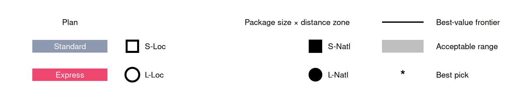
marker_legend() above lays out one flat list of icon + label rows. Some legends need more structure than that - an icon grid crossed by two dimensions, a block of colour tiles for a grouping variable, and a small key for extra symbols (a trend line, a shaded band, a flagged point) - all in one figure. legend_canvas() builds exactly that from a single tidy data frame, df_legend, where a type column tells it what to draw:
icon |
An icon marker at row/col
|
grid_section |
swatch |
A filled rectangle |
group_section or symbol_section
|
line |
A short line segment |
symbol_section |
point |
A bold glyph (default "*") |
symbol_section |
icon-typed rows always render as icons no matter what type says - the value is a bookkeeping label there, not a switch. swatch/line/point are the only values key_legend() actually dispatches on, and that dispatch is the only place a new type could be added.
Deriving the icon grid from data with icon_grid()
If your icon-grid combinations already exist in a data frame - say, one row per package-size / distance-zone combination - icon_grid() derives the unique row/col positions for you instead of typing them by hand. Factor columns keep a deliberate row/col order; unordered columns sort automatically.
df_plans <- data.frame(
size = factor(c("Small", "Small", "Large", "Large"), levels = c("Small", "Large")),
distance = factor(c("Local", "National", "Local", "National"), levels = c("Local", "National")),
icon = c("square-hollow", "square-solid", "circle-hollow", "circle-solid"),
stringsAsFactors = FALSE
)
df_plans$cell_label <- paste0(
substr(df_plans$size, 1, 1), "-",
c(Local = "Loc", National = "Natl")[as.character(df_plans$distance)]
)
df_grid <- icon_grid(
df_plans, icon = "icon", label = "cell_label",
row = "size", col = "distance"
)
df_grid
section type label color icon row col
1 grid icon S-Loc <NA> square-hollow 1 1
2 grid icon S-Natl <NA> square-solid 1 2
3 grid icon L-Loc <NA> circle-hollow 2 1
4 grid icon L-Natl <NA> circle-solid 2 2
Assembling grid + group + symbol sections
Combine that grid with a colour-tile group (group_section) and a small symbol key (symbol_section) by rbind()-ing three data frames that share section/type/label/color columns:
Show the code
plan_colours <- c(Standard = "#8D99AE", Express = "#EF476F")
df_legend <- rbind(
df_grid,
data.frame(
section = "plan", type = "swatch",
label = names(plan_colours), color = unname(plan_colours),
icon = NA, row = NA, col = NA
),
data.frame(
section = "value", type = c("line", "swatch", "point"),
label = c("Best-value frontier", "Acceptable range", "Best pick"),
color = c("black", "grey75", "black"),
icon = NA, row = NA, col = NA
)
)
legend_canvas(
df_legend,
grid_title = "Package size × distance zone",
group_section = "plan", group_title = "Plan", group_width = 0.9, group_gap = 0.3,
symbol_section = "value", symbol_right_gap = 0.8, symbol_key_width = 0.5,
col_spacing = 2.2, row_spacing = 1.2, label_gap = 0.15,
marker_size = 5, label_size = 3.6, dpi = 150
)
Tip
group_title lets the displayed heading differ from the section value used to match rows - keep section values plain and lowercase ("plan") while the on-plot title stays capitalised ("Plan"). grid_section and grid_title work the same way for the icon grid.
Column spacing has to leave room for your longest label in that column before the next section starts - if sections start overlapping, widen col_spacing, group_width, or symbol_right_gap rather than shortening labels first.
Stacking a plot and its legend with legend_strip()
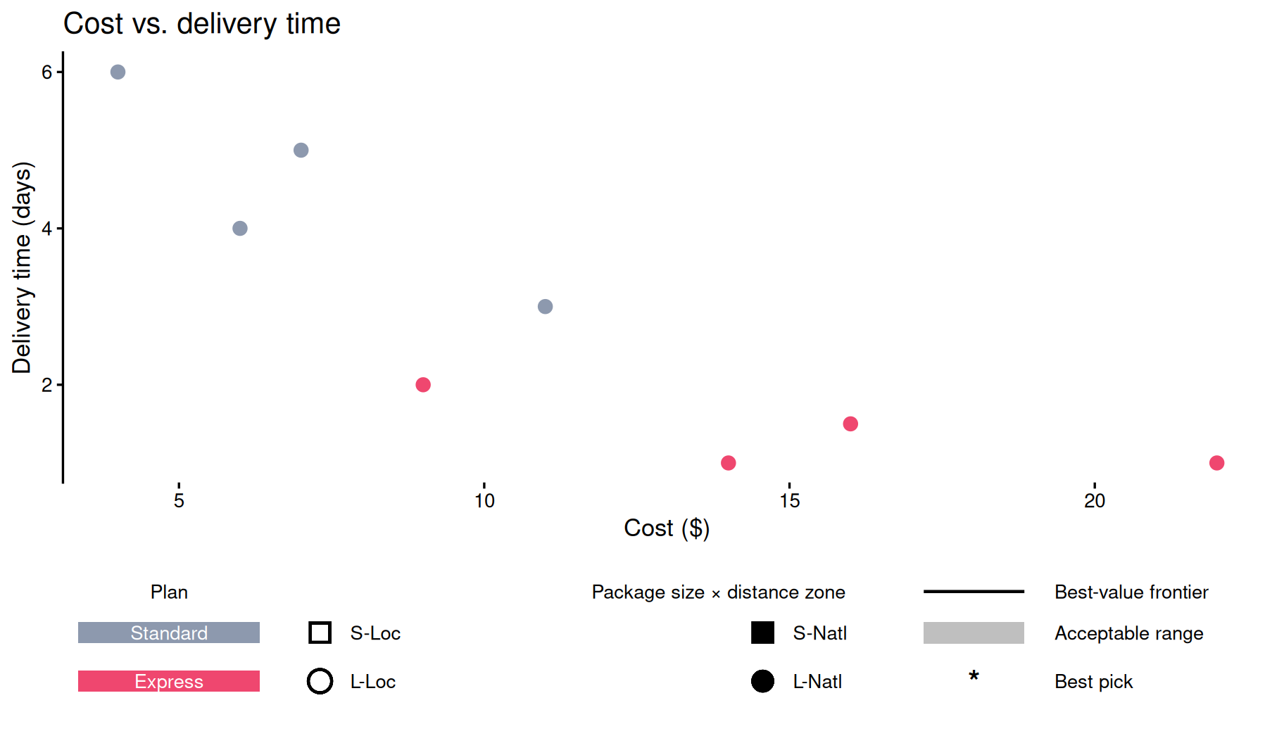
The composite above is a self-contained ggplot. To pin it under a real plot in one exported figure - rather than a standalone panel - add it with legend_strip(strip_plot, height):
Show the code
df_points <- data.frame(
cost = c(4, 6, 9, 14, 7, 11, 16, 22),
days = c(6, 4, 2, 1, 5, 3, 1.5, 1),
plan = c("Standard", "Standard", "Express", "Express",
"Standard", "Standard", "Express", "Express")
)
p_main <- ggplot(df_points, aes(x = cost, y = days, colour = plan)) +
geom_point(size = 3) +
scale_colour_manual(values = plan_colours, guide = "none") +
scale_x_continuous("Cost ($)") +
scale_y_continuous("Delivery time (days)") +
ggtitle("Cost vs. delivery time") +
theme_classic(base_size = 13) +
theme(axis.line.x = element_blank())
p_legend <- legend_canvas(
df_legend,
grid_title = "Package size × distance zone",
group_section = "plan", group_title = "Plan", group_width = 0.9, group_gap = 0.3,
symbol_section = "value", symbol_right_gap = 0.8, symbol_key_width = 0.5,
col_spacing = 2.2, row_spacing = 1.2, label_gap = 0.15,
marker_size = 5, label_size = 3.6, dpi = 150
)
p_main + legend_strip(p_legend, height = 1.4)

Tip
height is a physical size in inches, independent of the main plot’s own aspect ratio - set it once and ggsave(width =, height =) on the combined figure exactly like any other ggplot. Dropping theme_classic()’s bottom axis.line (as above) avoids a redundant rule sitting right above the legend - keep the left axis line, drop only axis.line.x.